B2C
User Research
Complex System
Transforming Creative Briefs into Actionable Plans for Design Students

Challenge
Problem
Design students often juggle multiple projects, deadlines, and classes at the same time. When a new brief arrives, they try to manage it across several tools- notes, calendars, task apps, and whiteboards - and the workflow becomes fragmented. That fragmentation leads to missed deadlines, stress, and a messy process that can hurt confidence and academic performance.
Goal
Design a one-stop workspace that helps design students succeed by turning briefs into clear, actionable steps - and keeping planning, tasks, and ideation in one consistent system.
Limited Time and Attention
Students are stretched thin. Anything that requires setup, learning new logic, or heavy configuration gets dropped fast. They need something that’s immediately understandable and reduces cognitive load.
Difficulty in Planning
Unfamiliarity with design methodologies and estimating task durations makes forward planning challenging, even for those with strong time management skills.
Analysis Paralysis
Design briefs often feel open-ended. Students overthink their approach, spend too long exploring options, and delay committing to a direction — which slows momentum and increases anxiety.
I looked at two categories of tools students already use, each solves part of the problem, but neither covers the full workflow cleanly.

Project management tools
Students use these platforms to manage tasks and schedules, benefiting from dashboards and various views. However, their extensive features create a steep learning curve, making them time-consuming to set up and often not tailored to the specific needs of design projects.

Ideation tools
These applications excel in documentation and brainstorming, offering simple, user-friendly interfaces that reduce cognitive load. However, without careful organization, their whiteboards can become cluttered and overwhelming, hindering productivity.
Takeaway: Clap needed PM-level clarity, but with the approachability of a whiteboard.
Before designing the breakdown flow, I reviewed dozens of academic briefs to understand what “brief structure” really looks like in school. I grouped them into three archetypes — and chose to focus this project on structured briefs first.
Structured
Typically in earlier years: a highly detailed week-by-week plan with methods, deliverables, and presentation guidelines.
Semi - Structured
Often later years: less instructional detail, more emphasis on scope and timeframe expectations.
Freestyle
Most common for senior / independent work: abstract briefs where students define their own goals, process, and outputs.
If the layout and system logic stay stable across the experience,
students spend less energy “figuring out the tool” - and more energy
finishing the work.
SMART goal-oriented process
The workflow should nudge students toward specific, measurable steps with clear milestones - so progress feels concrete instead of vague.
Keep it all in one place
Instead of bouncing between multiple apps, Clap should combine planning, tasks, and ideation in one workspace - reducing friction and context switching.
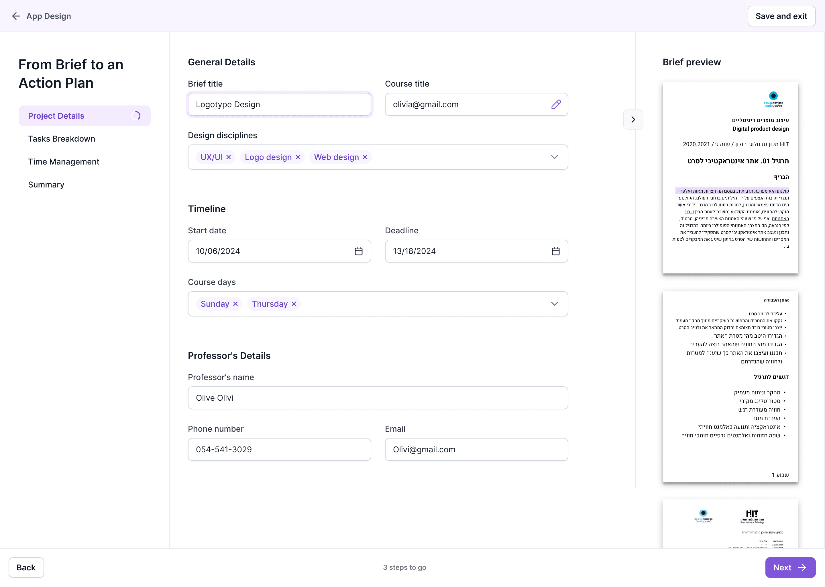
In Clap's initial wizard design concept, machine learning algorithms were used to auto-fill brief details. However, user feedback revealed concerns about data reliability and a lack of transparency in how the AI processed their briefs.
To address this, I added a collapsible third column displaying the original brief next to the extracted content. Each field has an eye icon that highlights the corresponding text when hovered over, improving transparency and helping users confidently learn to extract action items for future projects.
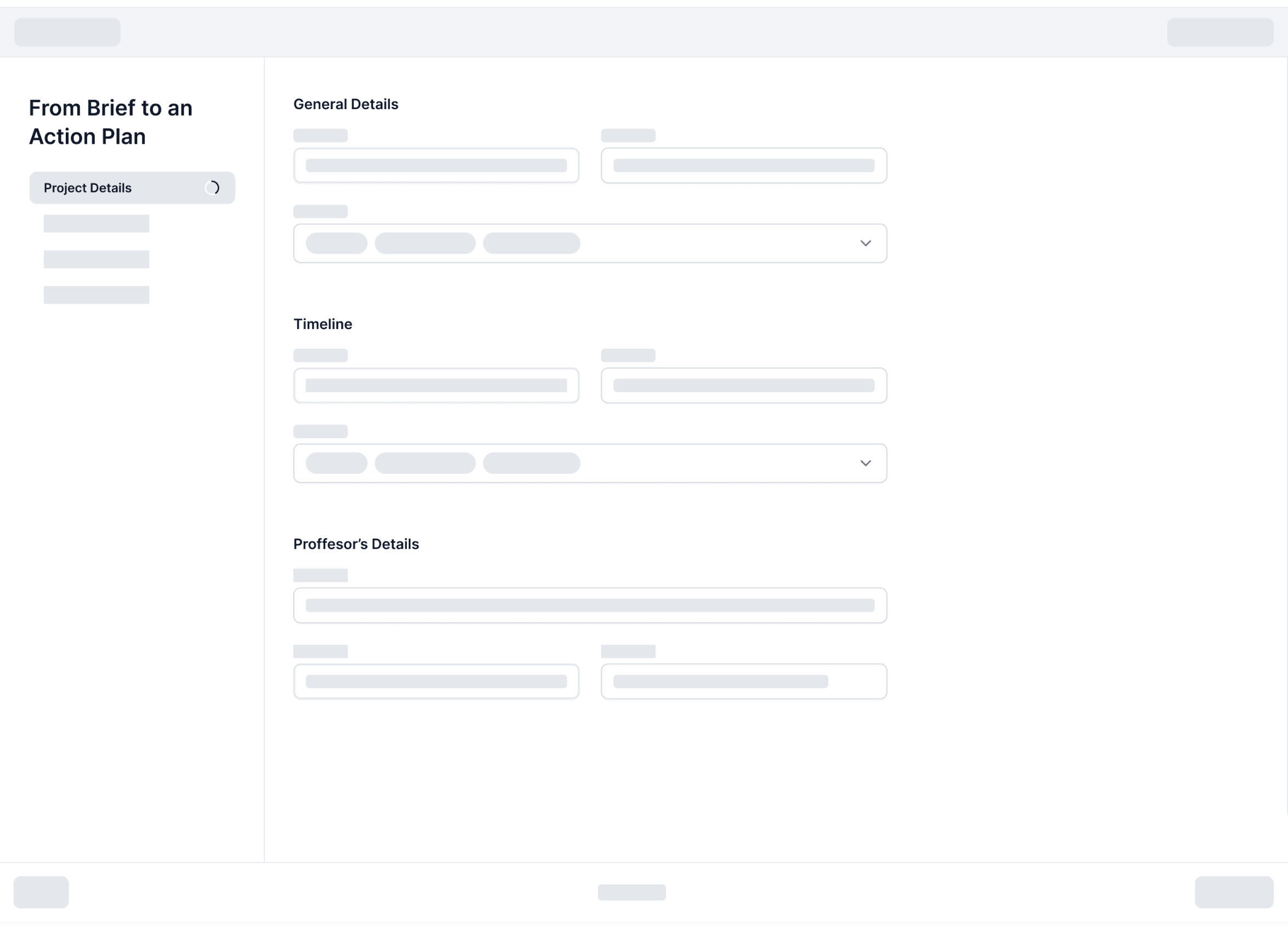
Before / no validation mechanism
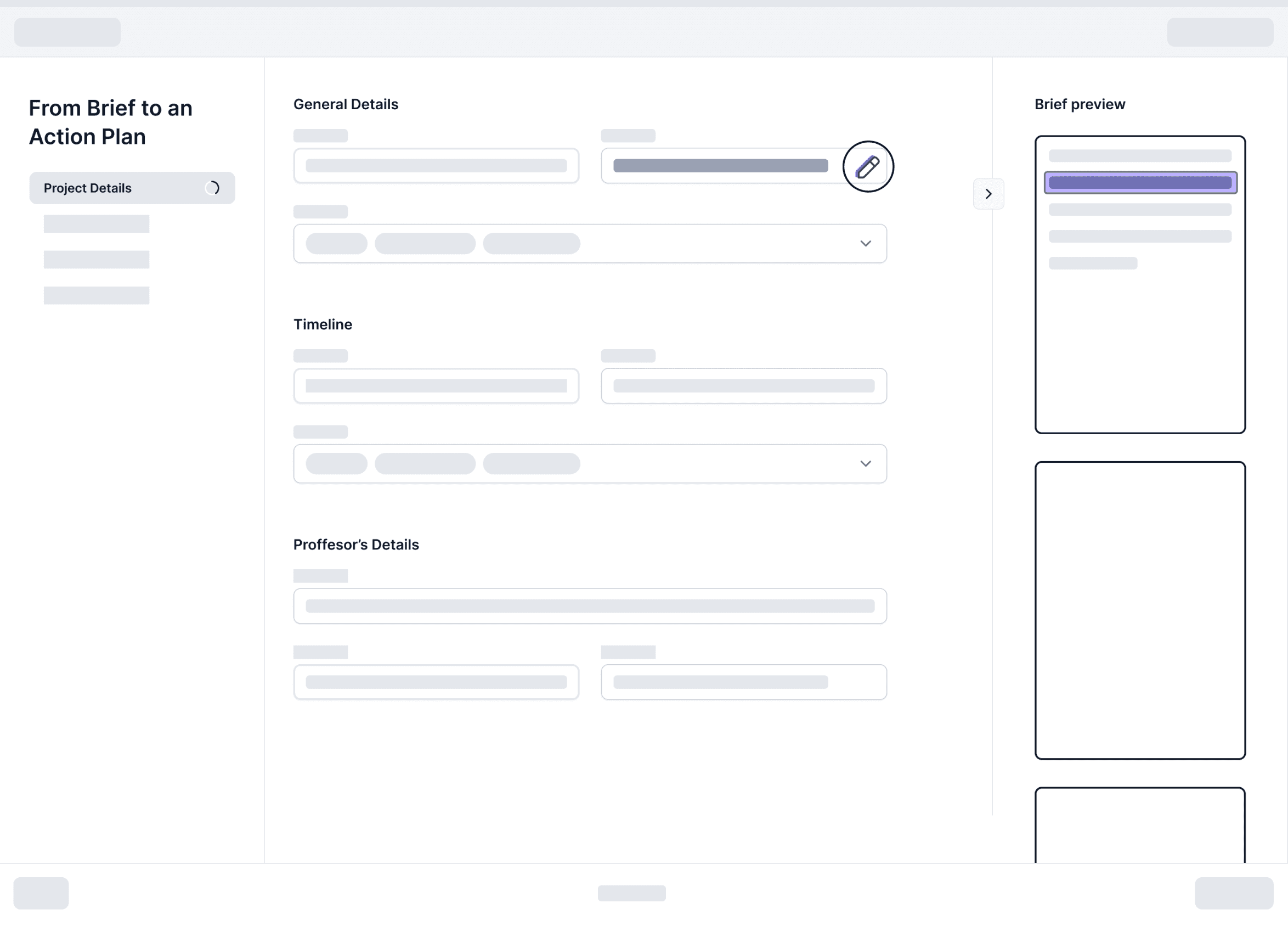
After / 3rd column is added to the layout containing the brief. Clikcing on the marker icon highlights data pulled from the brief
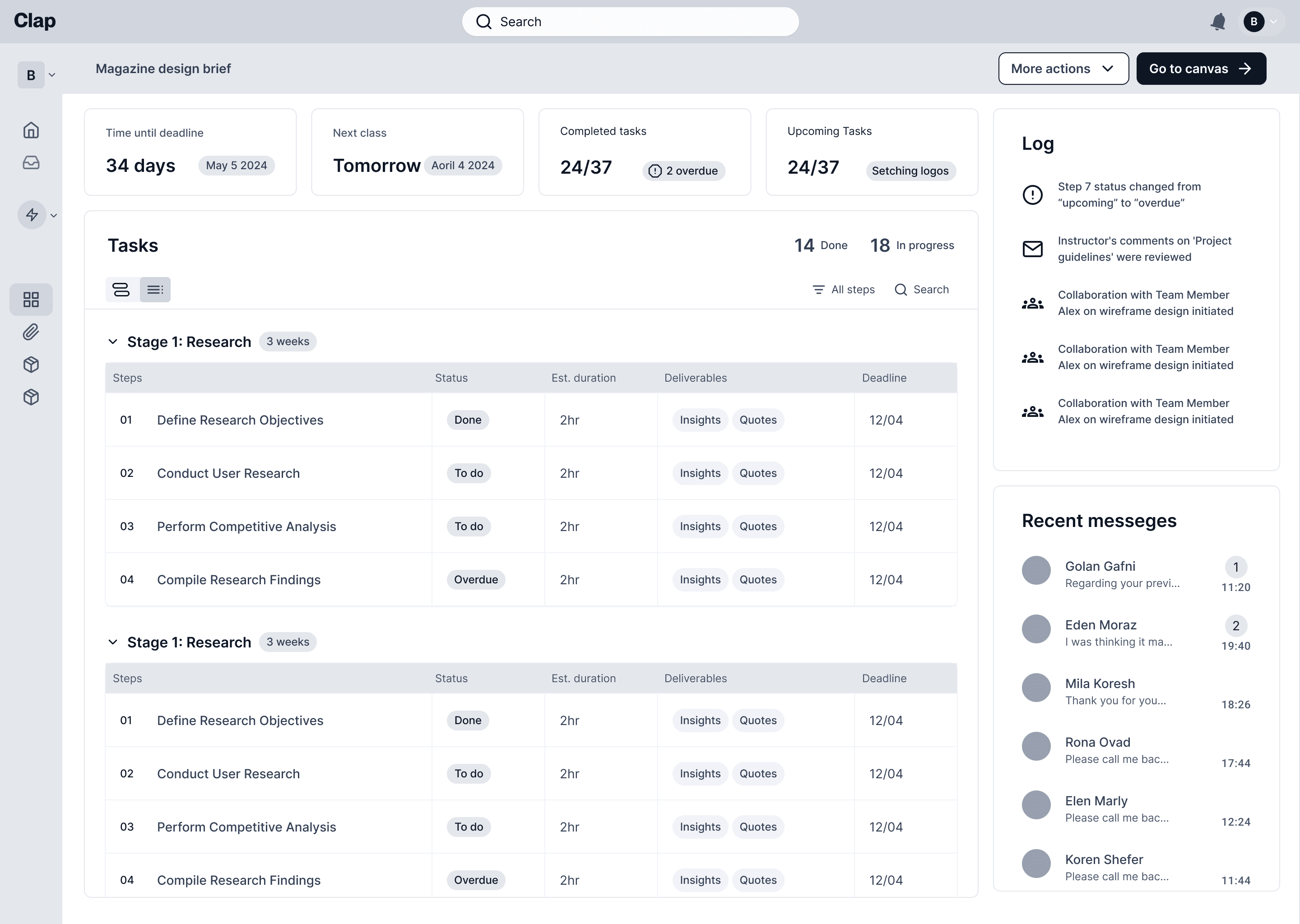
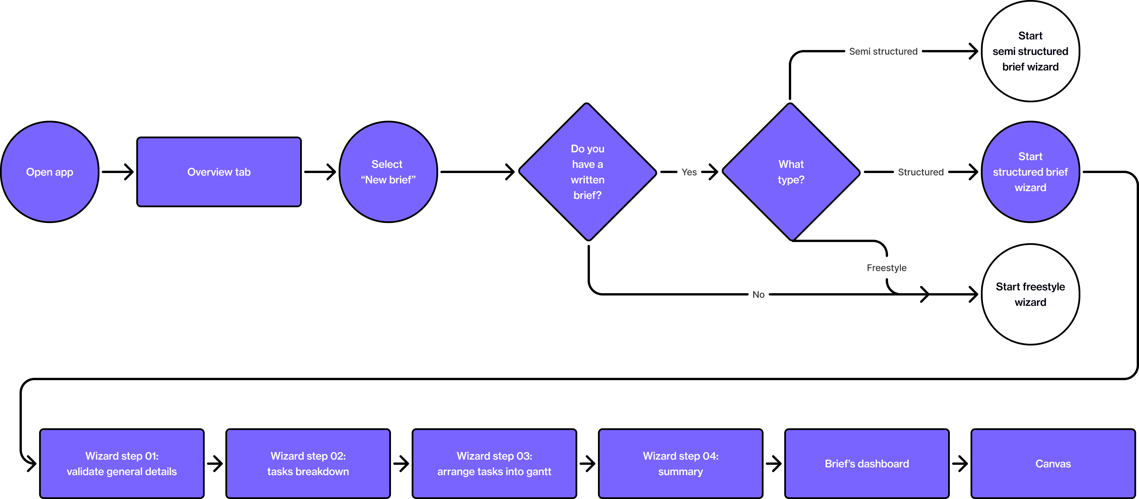
Overview Tab
A quick “what matters now” view for students who have limited time and energy. It surfaces active tasks, deadlines, and alerts in context, so users don’t waste attention deciding where to start - they can pick the next action and move.
This step turns a long brief into a set of essential project facts (requirements, deliverables, constraints). I prototyped an auto-fill concept here - and designed it to be verifiable, so students don’t have to “trust the system” blindly. The brief panel + “show source” highlight lets them confirm details fast and keep momentum.
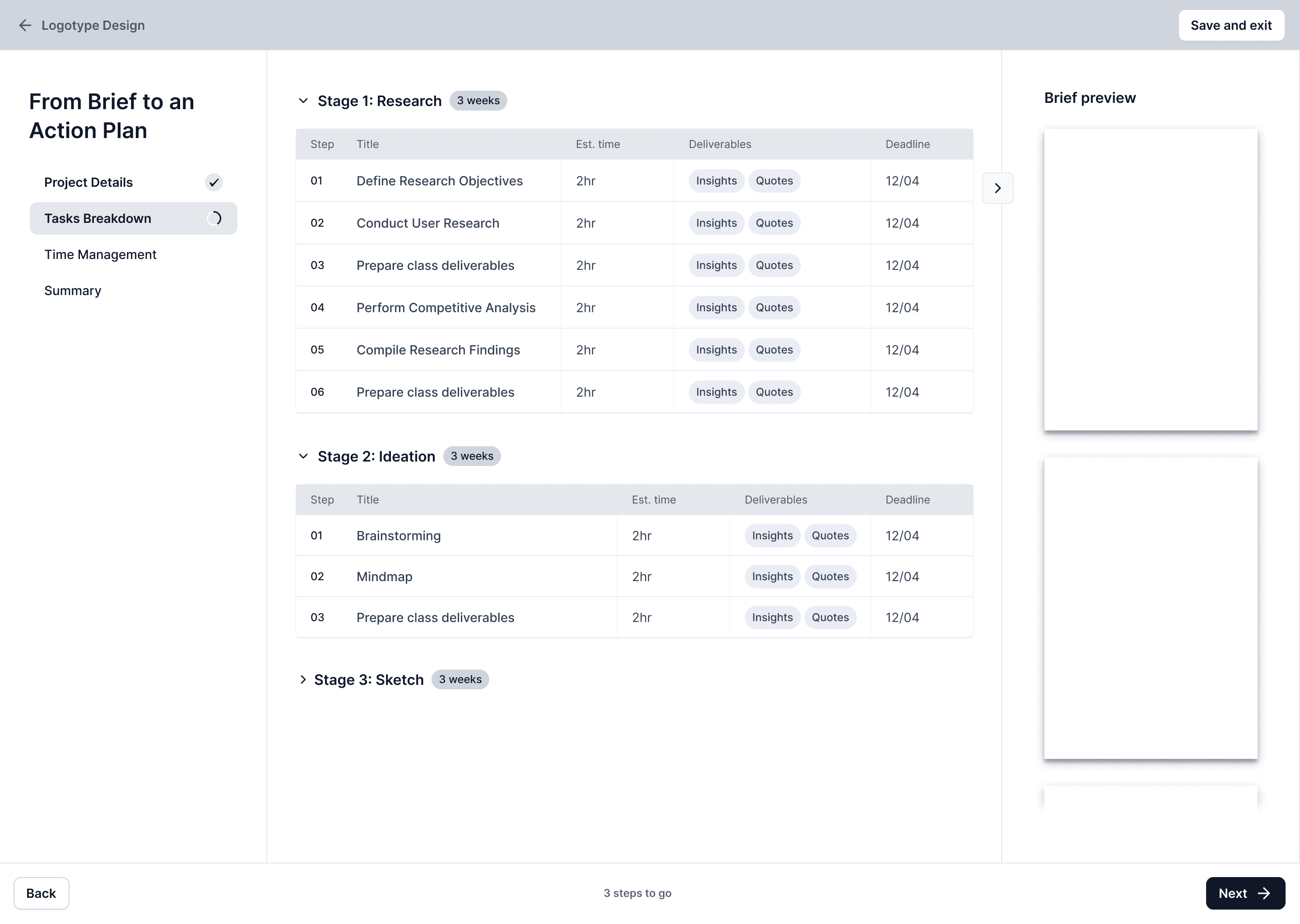
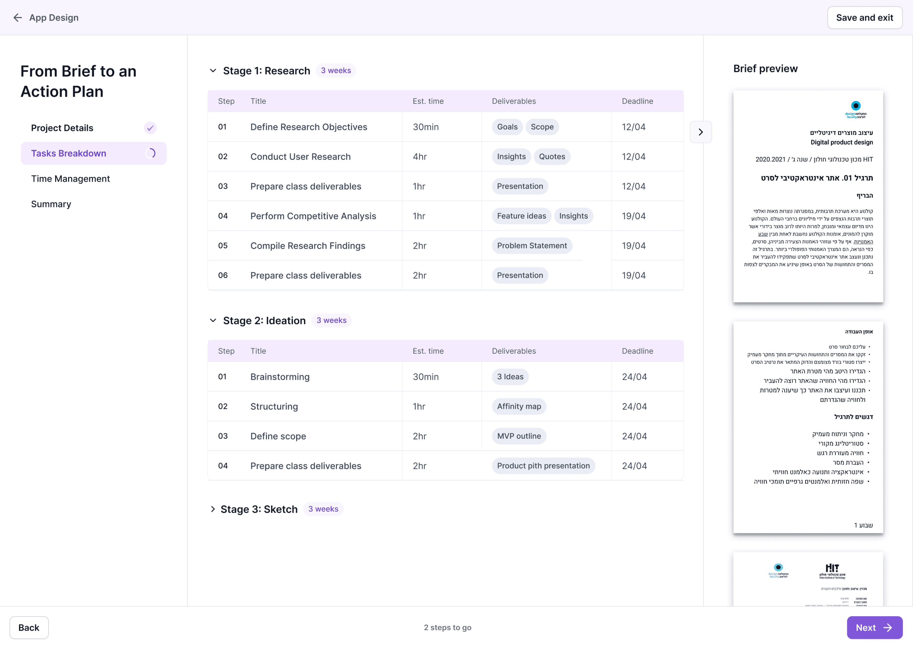
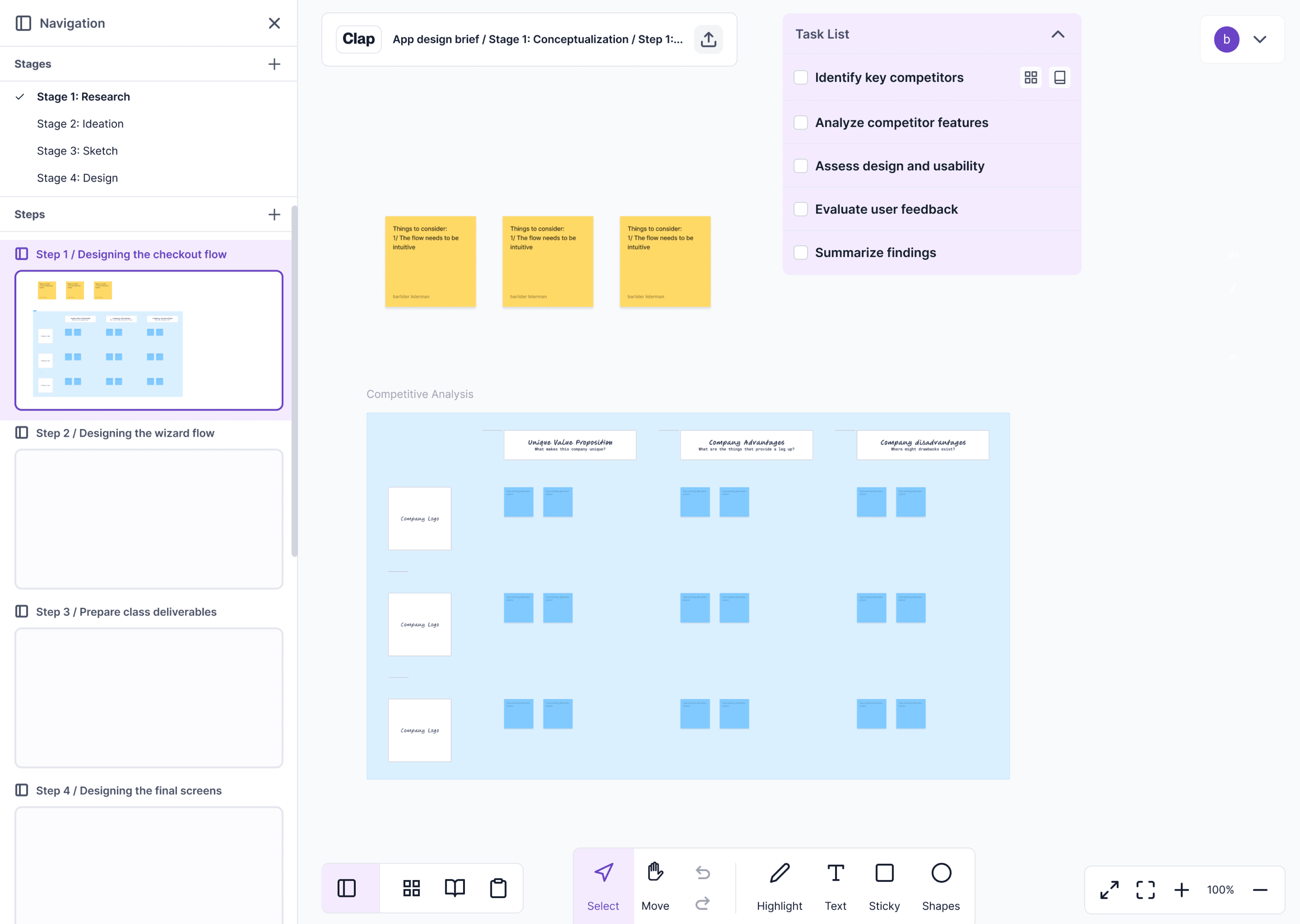
Here I turn the brief into a workspace skeleton. Unlike open-ended whiteboards, Clap generates pages and frames from the plan, so the canvas starts structured by default and stays navigable later. Keeping the workspace structured and preventing the “endless whiteboard” problem.
At this point, the brief has already been translated into structured fields - so I remove the side brief panel and shift the layout to full-width. That UX choice is intentional: it reduces distraction and frees space for what matters now—turning stages into a timeline, adjusting durations, and fitting the plan into real deadlines and schedules.
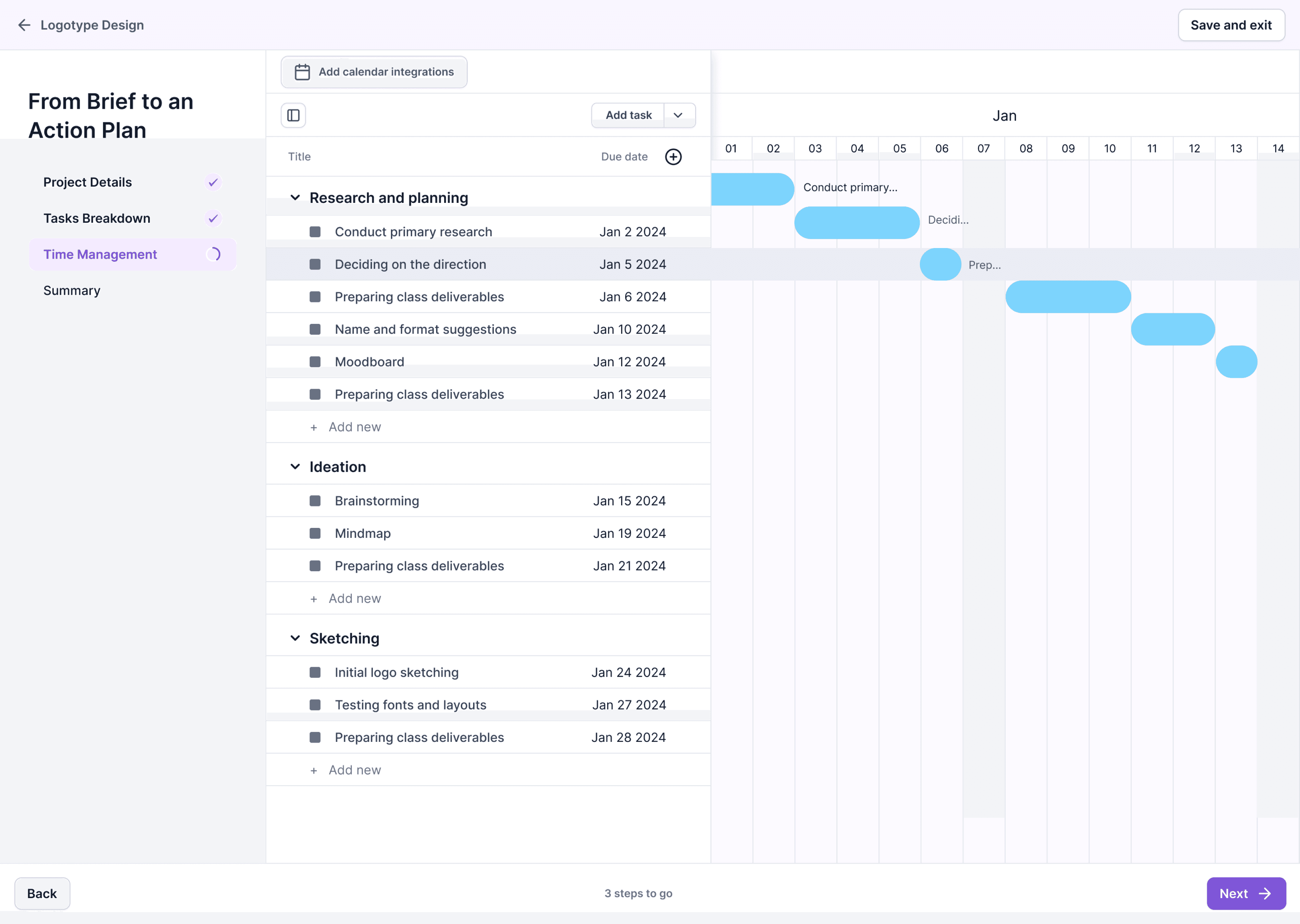
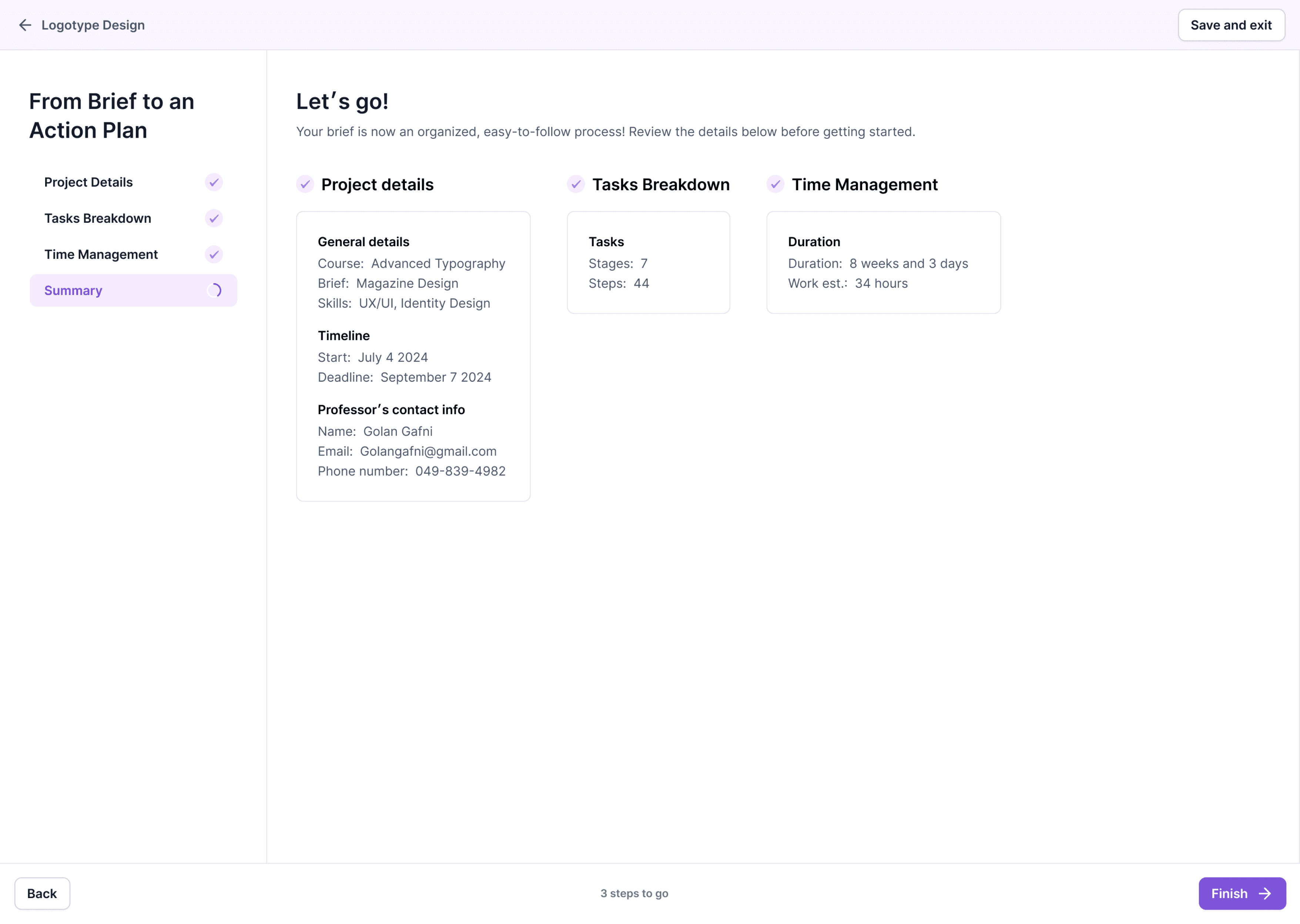
The final step is a review screen: a last chance to confirm inputs before creating the project. This is a simple but important moment for confidence - users know what they’re committing to before the system generates the workspace.
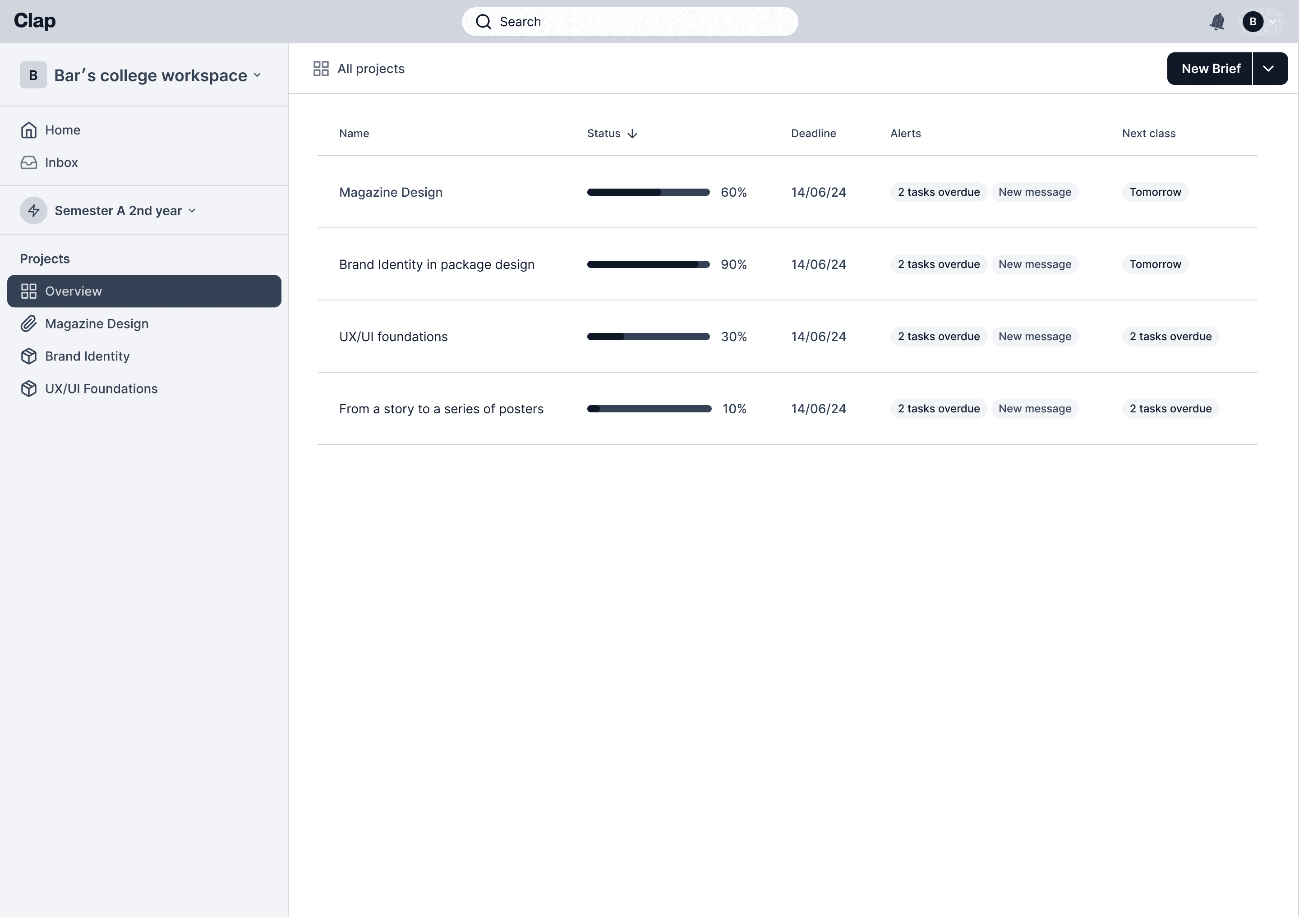
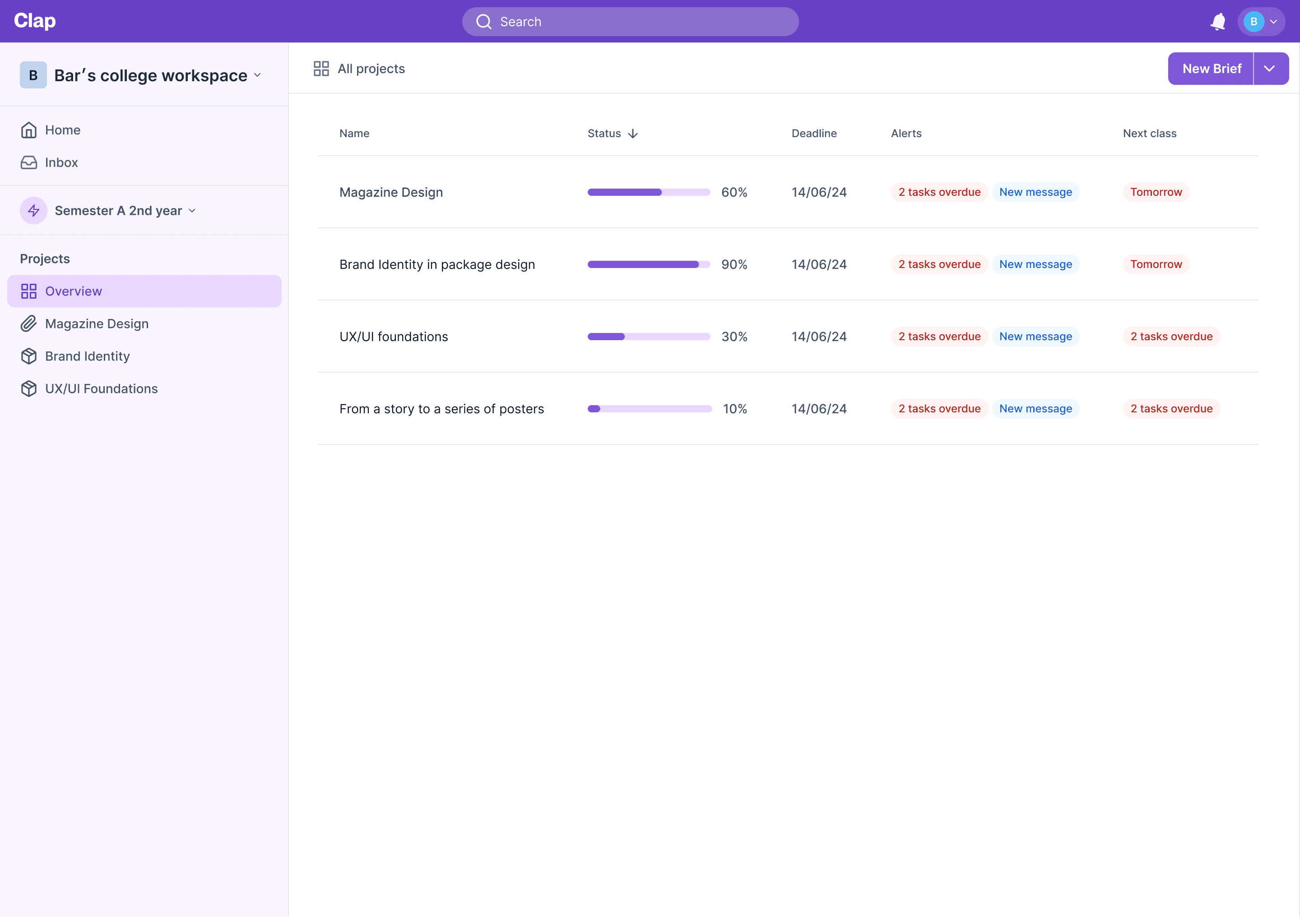
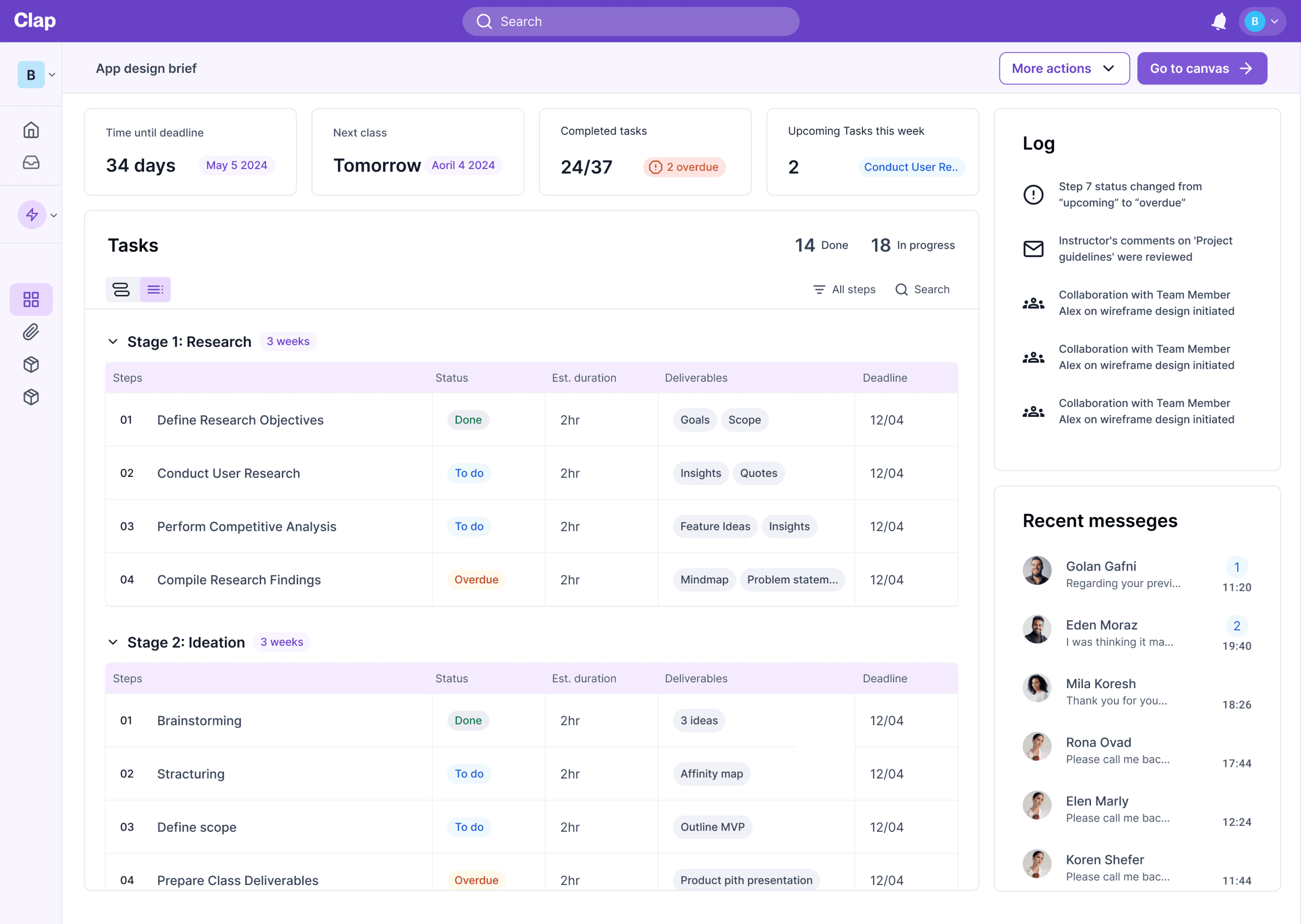
Project’s
Dashboard
A simple, stable control center for multiple projects, designed for students who get overwhelmed by too many views. It’s intentionally “just enough”: quick status, control, and clarity, without turning into another complex tool they need to learn.
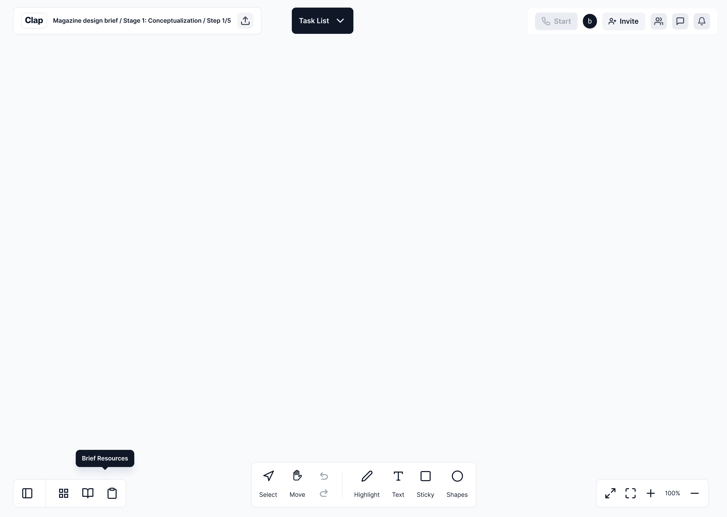
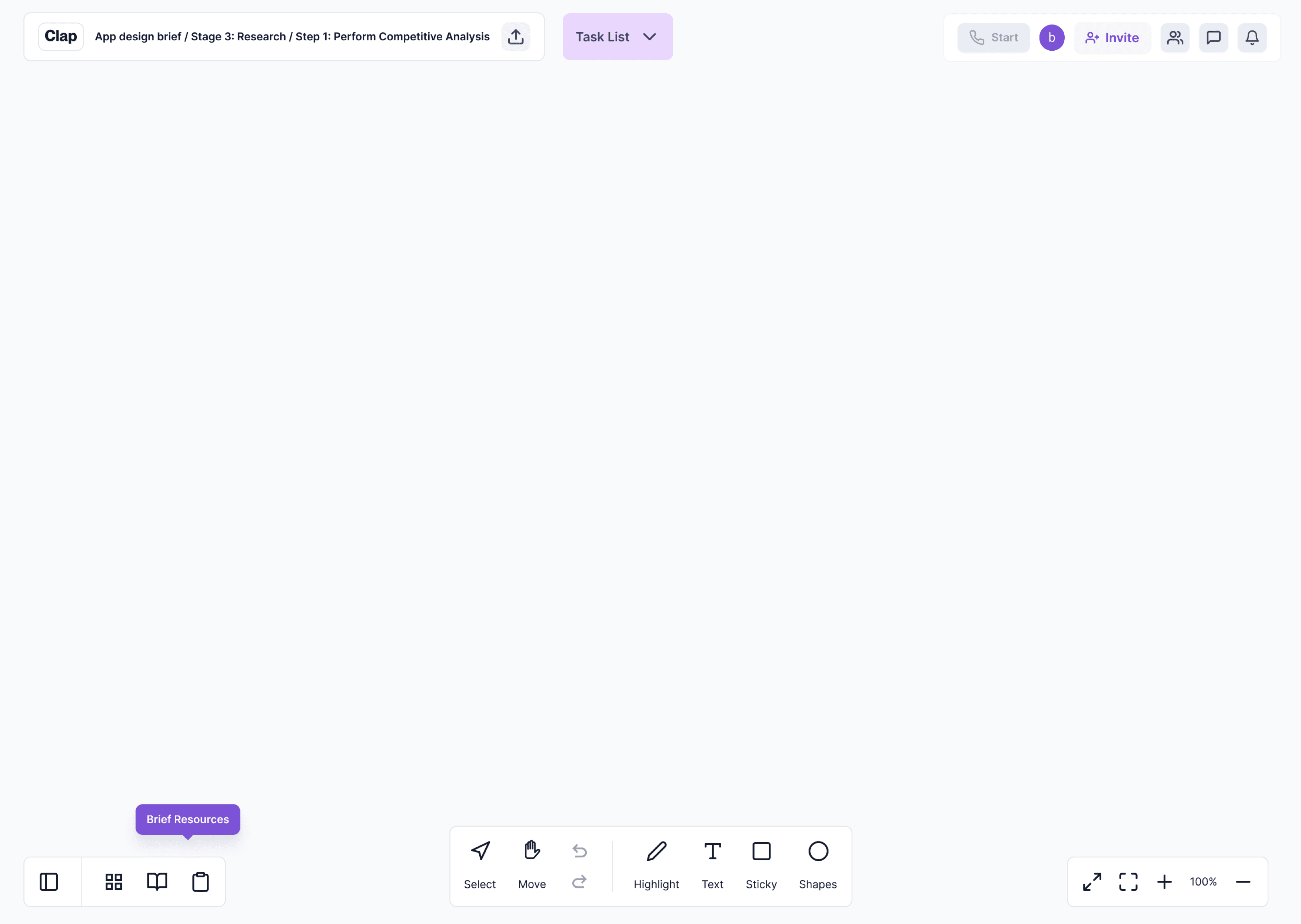
The Canvas
A whiteboard that stays creative - but doesn’t become a dumping ground. The difference from FigJam/Miro is the starting point: the canvas is anchored to the brief-derived structure, so ideation happens inside a plan instead of replacing it. This directly targets analysis paralysis: it gives freedom, but removes the “blank infinity” problem.
This project has been a valuable learning experience. Working on a complex system taught me to think critically about how each component impacts the overall design, focusing on scalable solutions that maintain clarity as the system evolves.
I also learned the importance of balancing user needs with practical constraints. While research is vital, prioritization is key to ensuring the most impactful features are implemented.
B2C
User research
Field experiments
Mobile app


